PYTHON: SLITHERING REPTILE OR POWERFUL VISUALIZATION TOOL?
Human tendency is to avoid or even fear what we don’t understand. All too often this avoidance/fear includes computer programming languages. And that’s unfortunate because with even a littleprogramming knowledge, one can perform some highly useful operations. Such is the case with Python and blast test data. The goal of this article is to introduce some simple, yet powerful, Python code that will enable a user to transform that collection of test data he/she has tucked away on the hard drive into some full-color graphs. Admittedly, one could use a common spreadsheet tool to get some rudimentary-looking graphs, but why play in the sandbox when one can go to the beach? And nice-looking graphs are just the beginning. Learning Python can open up a whole new world of scientific computing possibilities that can serve a user well in a variety of data analysis projects.
Before we dive into Python, let’s look at some output examples. Figure 1 was produced by executing a simple Python program called single_plot.py. This snippet of code reads recorded acceleration data from a CSV (character-separated value) file and transforms the data into a plotted function. Additionally, the program calculates and displays the number of samples in the data file as well as the sample rate and the time step.
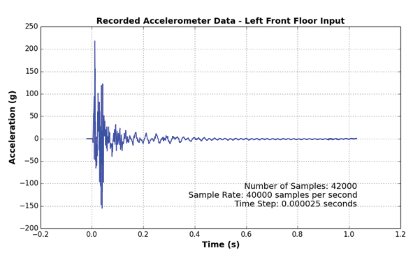
Figure 1: Example of Acceleration Graph.
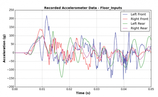
As shown in Figure 2, multiple acceleration records can also easily be plotted on the same graph with multi_plot.py. This output provides a convenient way to compare results from different accelerometer locations. A legend identifies each of the color-coded records. And plot limit controls enable the user to produce a close-up view based on his/her desired time window.
Figure 2: Graph of Multiple Acceleration Records.
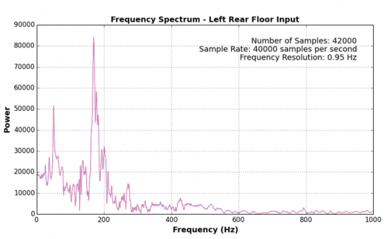
As any good blast data analyst knows, a look at the time series data does not tell the whole story of the blast response. A frequency spectrum plot, such as that shown in Figure 3, provides the analyst with essential information about the frequency content of the data. This graph was produced by executing a Python program called spectrum_ plot.py. Using the same data file as in Figure 1, the code reads and transforms the data from the time domain into the frequency domain to create the frequency spectrum graph shown. This program also calculates and displays the number of samples, the sample rate, and the frequency resolution.
Figure 3: Frequency Spectrum Graph.
SNAKE HANDLING FOR BEGINNERS
The first hurdle to overcome before one can unlock the power of Python is to download and install it locally. The good news is that it’s free and easy to download (www.python.org ). Admittedly, sometimes the install can require a little patience; however, users should not be discouraged if they get stuck. Chances are someone else has already encountered the same problem, so users experiencing installation difficulties should investigate the problem by searching the web. Once a user has installed Python, he/she will need to download and install the following modules to extend Python’s capabilities for scientific computing, data visualization, and CSV file manipulation: numpy, scipy, matplotlib, and csv. Information regarding each of these applications is found at www.numpy.org , www.scipy.org , www.matplotlib.org , and https:// docs.python.org/2/py-modindex. html respectively.
A NOTE ABOUT DATA FILES
Text files (.txt) and CSV files (.csv) are common test data file types. Text files can easily be converted into CSV files and vice versa using a common spreadsheet program or text editor. The Python programs described herein use a CSV file called Floor_Inputs.csv. The data in this file are arranged in rows and comma-delimited columns, as shown in the text editor screenshot in Figure 4. Reading the same file into a common spreadsheet program displays the data in separate columns based on the comma delimiter.
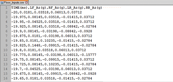
Figure 4: Property Formatted CSV Data File.
GETTING DOWN TO THE NITTY-GRITTY
Now that we’ve installed Python and the required modules, let’s take a look at some code. One can find all three of the Python programs described in this article at www.piezopy.org under the Code Snippets pull-down menu. Each of these can be copied and pasted into the user’s favorite text editor and saved. Of course, the user will also need a CSV data file in the format (shown in Figure 4) with his/ her acceleration data. Now let’s take a look at single_plot.py starting at the top and working our way through the program a few lines at a time.
As shown in Figure 5, the top line contains the program filename. Note that anything with a # sign in front of it is a comment to help the user understand the program; it is not an executable part of the program. The next section, bounded by three repeating quote marks, contains a brief description of the program’s functionality along with authorship and version information. Lines 14–17 direct Python to use the modules listed to expand its capabilities.
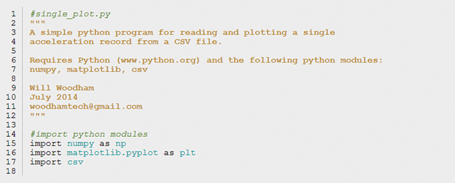
Figure 5: The single_plot.py Program, Lines 1–17.
As shown in Figure 6, lines 19–42 contain repeatable sections of code called methods. These subroutines act as small programs within a program. They receive input variables from the main program, perform a function based on that input, and return an output variable. The single_plot.py program has only three methods. The first method, starting at line 19, is called samplecount. This method counts the number of samples (rows) in a CSV data file. The resulting value is stored in a variable (n) and returned to the main program. The value contained in n is then used in other methods, including the method, starting at line 27, called construct. This method reads the data from a single column in a CSV file and creates an array for that variable. Our example CSV data file contains five columns; column 0 for time and columns 1–4 for acceleration. In this case, construct is called twice in the main program, first to construct the time array (t) using data from column 0 and then again to construct the acceleration array (Az) using data from column 1. The last method, starting at line 39, is for calculating the sample rate based on the number of samples (n) and the time array (t).
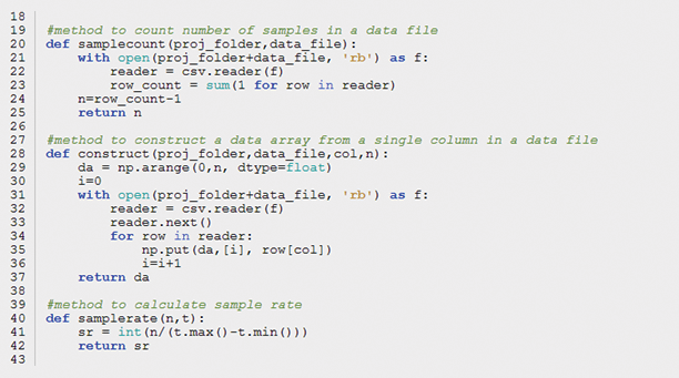
Figure 6: The single_plot.py Program, Lines 19–42.
Now that we’ve addressed these important prerequisites, let’s proceed to the main program. As shown in Figure 7, lines 46–48 identify the specific name and location of the CSV data file to be used. One will need to modify these lines for his/her particular case. Lines 50–55 are a nonexecutable reference map of the data contained in the CSV file. This map also should be modified for the user’s particular case, ensuring he/she has the correct variable and units for each data column. Line 58 creates a text label for the acceleration data that will be used later in the plot title. Line 61 is where the main program calls the samplecount method described previously and stores the number of samples in the variable (n). Lines 64 and 65 are calls to the construct method, where the time (t) and acceleration (Az) data arrays are created. Because the time data in our example CSV file is in units of milliseconds, we convert this to seconds by executing line 68. This conversion makes the sample rate calculation more straightforward. As described previously, line 71 is a call to the method samplerate, which stores the calculated value in the variable (sr). The time step or interval between samples (dt) is calculated on line 74.
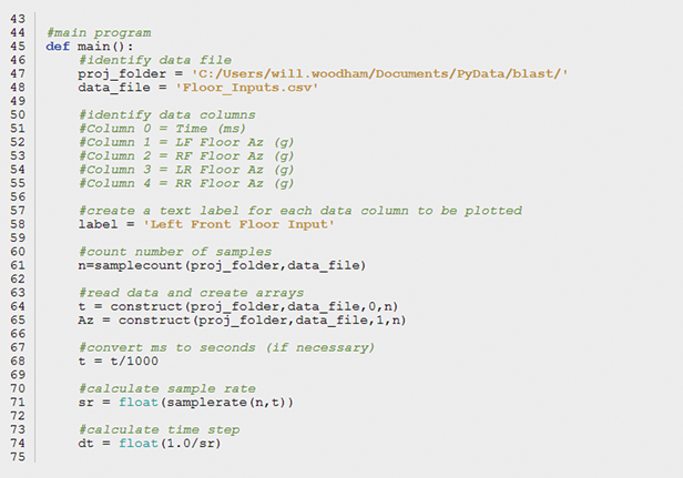
Figure 7: The single_plot.py Program, Lines 44–74.
Let’s now look at the code that unleashes the powerful and versatile graphing capabilities of Python and Matplotlib. As shown in Figure 8, the rest of the program, beginning with line 73, is dedicated to transforming all the data we gathered and calculated into a customized full-color graph. This transformation includes both displaying the graph in an interactive window and storing a PNG (portable network graphics) format image file containing the graph for future use.

Figure 8: The single_plot.py Program, Lines 75–96.
Line 77 creates an 11-inch-wide by 6-inch-tall figure in which to display the graph. Line 78 plots a blue curve representing the data for acceleration (Az) as a function of time (t) and stores it in the figure. Line 79 draws a grid with default grid spacing on the graph. Line 80 creates a title to go above the graph using the previously assigned data label. Line 81 specifies the label for the vertical axis while line 82 calls out the label for the horizontal axis. The user can customize items such as font size and font weight for these labels. Lines 84–87 use the plt.text function to print the number of samples (n), sample rate (sr), and time step (dt) directly on the graph in the lower right-hand corner. Line 90 saves the figure containing the graph to a PNG file with a specified path and filename. Finally, line 93 launches an interactive window and displays the figure within that window.
SEE SPOT RUN? GO SPOT GO!
To run single_plot.py, all a user needs to do (after Python and the required modules have been installed) is open a command window or console window, navigate to his/her project folder using the cd command, type python single_plot.py, and press Enter (as shown in Figure 9). Alternatively, one can just right-click on single_plot.py in Windows Explorer and select Open with Python. The user just needs to remember to modify lines 47–58 to match his/her data file before running it.

Figure 9: Running single_plot.py.
An interactive window, such as the window shown in Figure 10, should appear on the screen. Using the window interface control buttons at the bottom left, one can manipulate the graph by zooming in and out, panning, etc. A PNG image file of this same graph should also now be available for viewing in the user’s specified project folder. When finished, a user can simply close the window and the program will terminate.
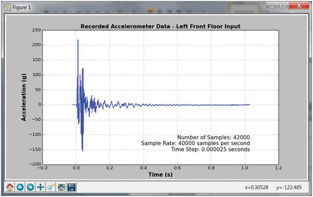
Figure 10: Interactive Window.
Now, let’s take a look at the other two blast data visualization programs covered in this article.
PYTHONIC THEME AND VARIATIONS
Because the basic structure of multi_plot.py is the same as single_ plot.py, we only discuss what makes them different rather than rehash what we’ve already learned with single_plot.py.
As shown in Figure 11, on lines 69–72 of multi_plot.py, instead of constructing a single acceleration array, as in single_plot.py, arrays for all four acceleration records found in Floor_Inputs.csv are constructed. As the name implies, lines 85–89 of multi_plot.py plot all four acceleration records on a single graph. Line 86 prevents each of the plot commands from overwriting the previous one. To focus in on the first 50 ms of data, line 96 specifies the horizontal axis limit to be 0.050 s. And finally, Line 99 sets up a legend on the graph for identifying the four color-coded acceleration record plots. The rest of the program is the same as single_plot.py described previously.
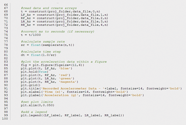
Figure 11: The multi_plot.py Program, Lines 66–100.
AN ALTERNATE VIEW OF THE UNIVERSE
As humans, we are accustomed to viewing the world within the time domain. We don’t naturally think about how things might look in the frequency domain. Moreover, as blast data analysts, we know that when it comes to evaluating the response of a structure to blast loading, the frequency domain is extremely important. A frequency spectrum graph provides us with an alternate view of the data that sheds light on the frequency content of the data and how that content is distributed. A frequency spectrum graph is a plotted function of relative power with respect to frequency. The higher the amplitude, the higher the relative power of that particular frequency in the data.
Frequency response analysis is a deep subject and deserves more attention than we can afford to provide it in this article. Having said this, let’s stick to providing a way to visualize the data in the frequency domain and leave the frequency response discussion for another time. Although much different in the result, the structure of the spectrum_plot.py program is highly similar to single_plot.py. This similarity allows us to once again focus on the differences rather than rehashing the parts that are the same.
As shown in Figure 12, the first difference we notice is that spectrum_plot.py requires additional module import commands on lines 18 and 19 to further expand Python’s capabilities to do signal processing.

Figure 12: The spectrum_plot.py Program, Lines 13–20.
On lines 82 and 83 (of Figure 13) we see that power (p) and frequency (f) arrays are constructed using fftpack module commands. Lines 85–91 create a figure and plot the power (p) as a function of frequency (f) on the graph with corresponding grid, title, and axis labels. Lines 93–97 limit the range of frequency to be displayed on the graph. And finally, lines 99–102 print appropriate data statistics directly on the graph.
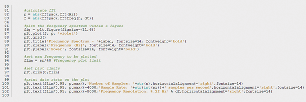
Figure 13: The spectrum_plot.py Program, Lines 80–103.
HUNGRY FOR MORE?
At this point, hopefully the user has a grasp of what’s possible with a little programming knowledge, Python or otherwise. If the user is hungry for more, he/she won’t want to miss the next article in this series, Blast Data Visualization Part 2: Generating 3D Animations with Python. We’ll build upon the Python foundation we’ve laid in Part 1 and delve into the wild and wonderful world of 3D animation. Happy slithering!


